28/08/2009

The 'real' Daily Prophet


I heard on the grapevine, from some Harry Potter-loving friends of mine, that the real Daily Prophet is being invented.  For those of you who have escaped Potter mania and are not in the know, the Daily Prophet is the most widely read and distributed tabloid across the wizarding world, complete with moving words and pictures.  So I did a bit of digging to see if the rumours were true…

…And while us muggles cannot expect to receive this magical newspaper any time soon, the concept is infact being worked upon by teams both across America and at Cambridge University.  They have been using revolutionary technology to produce the ‘world’s first flexible electronic screen’ according to a report in the Times entitled ‘Moving newspaper on flexible screen to be launched within months'.  Designed to compete with e-books available on computers and phones, the “intelligent plastic” display can be recharged and regularly updated.  However it seems for the moment that this new technology needs a little more developing to produce colour as well as black and white versions.  I found this clip on YouTube ‘The REAL daily prophet’ which speculates on the use of these electronic screens in not only newspapers, but windscreens and spectacles alike!  The short clip is quite extraordinary with incredible advances in technology, the stuff of which films are made.  Although not set to be launched for a few years yet…this is definitely one to watch this space!         

High speed typography

I came across this typography whilst browsing the creative review website and found it quite refreshing and extremely inventive.  Ad agency ‘Happiness Brussels’ have come up with a unique idea to promote the new Toyota iQ.  With a little help from some friends – namely professional photographers/designers Pierre and Damien from ‘Please let me design’, and interactive expert Zachary Lieberman – cue the creation of the iQ font. 

As car advertisements have progressively moved forward in sophistication and creativity over the recent years (from Ford Focus’ ‘beautifully arranged’ orchestra of car parts to Skoda’s ‘full of lovely stuff’ model cake of the Fabia) it seems only fitting that the creative boundaries are further pushed.  And Toyota has risen to the challenge by concocting some fresh and unique typography formulated by the new compact iQ. 

As pro racing driver Stef Van Campenhoudt was strapped into place and let loose behind the wheel of the miniature iQ, a clever tracking programme monitored by Lieberman recorded the motion of the car’s skids, translating them into ABC’s and 123’s.  Despite it’s obvious purpose as an eye catcher and talking point, the making of the font does illustrate the impressive steering on the iQ.  For a more detailed insight into the making of the iQ font, take a look at the video from Vimeo posted below, “When driving becomes writing”: 

iQ font - When driving becomes writing / Full making of from wireless on Vimeo.

26/08/2009

Mad about PHOTOBLOGS!

My next few posts are dedicated to a few of my favourite photoblogs, a.k.a. phlogs.  A collection of photo-centric weblogs, with hundreds of entertaining and creative pics posted and updated regularly.

Faces in Places

Brought to us by fellow blogger on blogspot.com, 'Faces in Places' is a photoblog that features a series of archived photographs presenting a selection of faces found in everyday places.  The photos contain inert objects to which human qualities have been attributed. 

There are links to a flikr group and discussions such as ‘are there more happy or sad faces in places’ – a fairly comical group in my opinion, especially as I myself am one to judge cars on whether their headlights are shaped as friendly or evil eyes!

Here are a few of my favourites taken from the Faces in Places website.  I now see faces everywhere!

Sleeveface

'Sleeveface' is the brainchild of Carl Morris, who set up the website alongside his friend John Rostron in 2007.  Another comical photoblog which encorporates, according to the website, ‘one or more persons obscuring or augmenting any part of their body or bodies with record sleeve(s) causing an illusion’ producing clever and witty images.


Sleeveface parties are apparently held by vinyl junkies across the world with the concept becoming popular on social networking sites.  ‘Sleeveface’ mania is substantially better established that faces in places, with what begun as a game between vinyl lovers now transformed into a book.  A great edition to the coffee table!  To visit the website click here.


Bad hair day

'Don't Judge my Hair' is a photoblog featuring bizarre hairstyles with the tag line ‘epic hairstyles’, an interesting label! Amongst the many photographs, some retro, some modern, there are countless and hilarious hairstyle failures which will have you in stitches.

The phrase ‘bad hair day’ doesn’t quite cover it! Here are some snaps taken form the website:

 To view more disastrous cuts, colours and styles from around the world visit 'Don't Judge my Hair' for yourself.  I can guarantee ‘What were they thinking?!’ will be the first thought to cross your mind!

The man behind the hand

The 'Souvenirs' project is not a photoblog as such, but is of a similar theme.  It is slightly different as the photographs featured are the work of one man only.   Michael Hughes travels the world taking snapshots of famous landmarks with cheap souvenirs placed in front of them.  With as many as 200 countries visited by Hughes, he has been able to refine his technique, capturing the souvenir in perfect proportion to the landmark in subject and its surroundings, producing a collection of over 100 fun and playful images.  Michael stumbled across the idea of creating such illusions and developed it as a hobby, producing photos that, at a glance, could be the real thing.

'I was on the tourist platform at the Lorelei cliffs next to the river Rhine when I held up a postcard I bought for my daughter.  I was amazed because it just seemed to fill a massive grey hole that was in the sky and it was the exact position the photographer had taken the picture from.

After that I noticed coffee cups from a shop near the Statue of Liberty had the statue printed on so I poured my drink on the floor, and position it in front of the statue.  Since then taking the pictures has developed into a hobby and a passion to the point where I have been taking trips recently just to photograph a souvenir next to its landmark.' 

Quote from an interview with Michael Hughes for the Daily Mail online.

These holiday snaps are no doubt a clever use of perspective – the best of which have been published in the book ‘Souvenirs’ as seen below.  Visit Hughes’ souvenir set on Flikr to view a slideshow of his work. 


23/08/2009

Electrolux presents...

The Electrolux Design Lab Competition is a global competition that invites design students to create innovative inventions for this year’s theme of household appliances over the next 90 years.  From digital wardrobes and washers that paint pictures on your clothes, to greenhouse robots that can walk on Mars, it seems to attract some fairly radical design ideas!  The competition website has listed the top 25 best entries from 2009, 8 of which will compete in the finals in London on September 24th this year.  Take a peek here to view 25 designs with pictures and information on each.

Designed for this year’s competition, The Kitchen Tree, by Australian designer Balin Lee, is one of my favourite entries.  Inspired by the growth of trees in nature, the Kitchen Tree incorporates advanced technology to render it adjustable to meet all of our individual needs when it comes to our daily use of the kitchen.  The model consists of five arms or ‘branches’ attached to independent rings that freely rotate around a central shaft or ‘trunk’.  The user is also able to customise the height of each arm to a level to suit their need.  There is a refrigerator at the top of the central shaft, with connections to each of the five pods and a built-in sensor, which enables them all to become refrigerators if required.  On top of this the pods may also function as cupboards or even freezers, alternating between states when desired.  There is a sink mechanism and a stove pot, which automatically springs into action when a pot is paced on top.  Sensors in-built into the arms detect a pot and illuminate temperature controls ready for use.  

Unlike some of the 25 wacky designs short-listed on the Electrolux Competition webpage listed above, I think the Kitchen Tree presents a useful and unique design that would certainly fit into modern homes today, with many different functions compacted together, saving time and space to assist a modern kitchen user.  However, despite some of the other designs appearing of little realistic use today, it is definitely worth checking them out as there are some great ones that we never know, might become integral over the next 90 years.  All are extremely intelligent and creative, and will definitely knock your socks off! 

Putting the 'sweet' in 'tweet'

Check out this little fellow, the Guardian Robot, created by Ken Lim to keep a watchful eye on your Twitter feed.  In the instance of a happy message it raises its arm in celebration, and in the presence of a sad message, it lowers its head in a bit of a stew.  More than this, the Guardian bot encourages a certain interaction… high-five it in its happy state and it returns to being idle... hug it in its sad state and it returns to being idle as well.

This quirky little thing does retain a certain charm, and will sit on your desk alerting you of your tweets.  Costing in at around £60, a relatively cheap buddy could be a welcome addition to your desk clutter! See below for a demonstration of the Guardian robot by Ken Lim.   

Ken Lim's Guardian Robot from InsideGuardian on Vimeo.

Foods from afar


The Far Foods project, as presented by designer James Reynolds, consists of an interesting alternative to food packaging, incorporating simple graphics reflecting an airport style theme.  Consisting of labels that wrap around food like suitcase stickers, Reynold’s proposes to inform the consumer of the origin of the food, the miles it has traveled and the amount of carbon dioxide released during the journey.  Additionally the receipt features a perforated strip, in the style of a ‘tear-off’ boarding card, summarising the total and cumulative information.

Always one to be interested in anything to do with food, I find this is a captivating approach – packaging that throws another factor into the mix that influences buying decisions, the environmentally-conscious concept of carbon miles, highlighting the distance your food has traveled from source to shelf.  How would this influence consumer behaviour?  Out with the calorie-counting, in with the carbon miles.  Would you pay more knowing the food you were buying had used less carbon miles?

With relevance to recent hype in the media and public eye about the benefits of local produce and buying close to home, food miles backs up the notion of reinvesting money back into the local community as well as helping to combat issues of global warming.

Overall a novel idea – eco-educational packaging –  in providing an understanding of where you food came from, a notion that most of us probably don’t think much about. Click here for Far Foods link.    

BP Portrait Awards 2009

Exhibition @ the National Portrait Gallery, St Martin’s Place, London, 18th June – 20th September

After picking up one of those ‘What’s on: Guide’ type supplements I decided to visit the BP Portrait Awards Exhibition at the National Portrait Gallery, London.  An annual and prestigious competition, I learnt that the BP Portrait Awards sees thousands of entrants from all around the world put forward their accomplishment in contemporary portraiture work.  This year, 2009 saw 1, 901 entries, a record number in the history of the event, and from there the winners were chosen and the remainder whittled down to 56 paintings to be showcased in the exhibition.  

Here are the portraits that won first, second and third prizes:

First prize awarded to Pete Monkman for his work Changeling 2 which contains a series of portraits of his daughter at different stages of her life, exploring the concept of childhood.

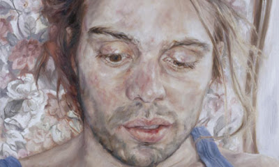
Second prize awarded to Michael Gaskell for his work Tom, a portrait of Gaskell’s 17 year old son.

Third prize awarded to Annalisa Avancini for Manuel, a portrait of 31 year old Manuel, in her aim to catch his story and personality through his face.

Upon arrival I was intrigued to be amongst works submitted from members of the public with varied backgrounds and training in the arts, in what felt like a sort of an extremely high quality talent show, one in which every piece was worthy of a prize.  The variety between portraits was of interest, in subject and in style.   Featured were the young and old alike, a Lord, a fisherman, a football fan, as well as subjects from different ethnic and cultural backgrounds.  However what really drew me in was being able to relate to the relationships between the subject and the artist, and pondering on the complex characters laid out in front of me.  Which family member is featured, what are they doing, what mood are they in, what sort of personality do they have.  Similarly here as when looking at the book 'Two Faced', it is the relationships between the sitter and the artist that have created such interesting portraits, and the intimacy that can therefore be conveyed within.  

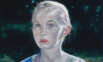
One of my favourites was this piece, Madeleine, by Jane Cooper.  The way she has captured the light falling across the little girl.  The juxtaposition of the furry headband symbolising fun and playfulness, against the pose, which suggests a certain fragility and seriousness making her old beyond her years.

The exhibition has quite an old-fashioned feel to it, in the exploration of portraiture in a fairly traditional sense without much pushing of boundaries.  Much of the work is photorealistic, with only a few exceptions of more naïve and abstract representations.  In fact there are perhaps a few too many photorealistic portraits, despite the extremely obvious high level of skill and incredible realism.  Overall however, the exhibition exudes energy and features an impressive range of portraits full of emotion, and committed to high quality figurative painting.

18/08/2009

Two Faced portraiture

‘A face is like a good guidebook to a city we are unfamiliar with: it doesn’t tell us everything, yet it tells us most of what we need to know’.  Quote by Adrian Shaughnessy whilst pondering how reliable our faces are in illustrating our personality and our moods.  It is the role of the portrait artist to scruntinise a face, pick up on those traits within, and transform them into a portrait imbued with likeness in the physical sense but also reflective of the personality of the subject.

“The person portrayed and the portrait are two entirely different things” Jose Ortega Y Gasset

I received Two Faced as a birthday gift last year, and it has since become one of my favourite books to flick through for creative inspiration.  Produced by Darren Firth of WIWP, it is a colourful collection of work by different influential and professional image-makers, split into two sections.  The first is a celebration of 21st century portraiture, showcasing a varied selection of portraits produced by different methods through many different creative mediums – from felt pen on paper to badges arranged on a board.  The second section contains series of portraits produced by pairs of artists coupled by Firth to create representations of one another.  The result is over 100 portraits found exclusively in this book and transforms Two Faced from merely a collection of portraiture to more of an art project in itself.  For me this pairing up of the artists is quite an interesting concept, the interaction between the two, producing work that is representative and revealing of characteristics belonging to both the subject and the artist, and then vice versa.  The book has quite a free and experimental feel to it, including interviews, quotes and biographies amongst the hundreds of illustrations.             

“A portrait, to be a work of art, neither must nor may resemble the sitter, one must paint its atmosphere” Umberto Boccioni

Overall an inspiring book that showcases colourful and exciting work created from an extremely wide variety of styles and therefore producing fascinating and contrasting outcomes – all originating from the same starting point, that of the face.  Work included by artists such as David Shrigley, McFaul, Stella Vine, Paul Willoughby, Marion Deuchars, Jonathon Ellery and many more. 

Walking in the Air


Last night I eventually got around to watching ‘Man on Wire’, a documentary film which I had recorded on my sky plus box a few weeks ago and until now not seen.  The film directed by James March was released in 2008, however I did not hear of it until recently when a friend of mine described in to me, telling me it had won a BAFTA and that it was being shown on tv.  Partial to a good documentary, and by all accounts this was a great documentary, I decided it was not to be missed.  I was not wrong!  

On 7th August 1974, the French artiste named Phillippe Petit spent 45 minutes transcended between the Twin Towers of the World Trade Centre.  On a slim metal wire 1350 feet above the ground, he walked, he lay, he danced his way across a number of 8 times in an enthralling illegal tight-walking feat.

Based on a booked published by Petit in 2002, this magnificent documentary is constructed as a heist film, with two major factors setting it apart from the rest – 1. It is a true story and 2. The intricate plot is woven around the theft of nothing more than air.  ‘Man on Wire’ is recreated with a series of archive material, photographs, video footage and interviews with Petit’s friends and associates, pieced together chronologically.  The film illustrates the passion involved in the years of planning this crazy adventure, from the day Petit first heard about the building of the Twin Towers and began to sketch his ideas right at the beginning, all the way through to the smuggling of the heavy wire cable up to the top of the buildings under a blanket of darkness the night before the grand finale. 

Marsh’s film does full justice to this incredible story highlighting the extreme lengths Petit’s team went to fulfill his dream, their will to sacrifice anything and everything to get there.  As the observer, the suspense builds up and up throughout the documentary as the day of the stunt gets nearer, will he make it, won’t he make it.  Indeed deep down we know he must make it as interview clips from the present day are included in the script, so the question is more how will he make it?  It seems such an impossible feat that can undoubtedly be classed as both pure stupidity and pure genius at the same time.   What adds even more to this awe-inspiring tale, is that when the time comes and he is up on that high wire spanning the twin towers, as the observer you can’t help but share Petit’s feeling of overwhelming exhilaration.  The onlookers at the World Trade Centre react with a mixture awe and gratitude, making for a very moving scene.  Phillippe’s philosophy is simple; life is not worth living, unless – quite literally – it is lived on the edge.  And for anyone wishing to escape their own reality for an hour or so and experience the mind-blowing reality of the Man on Wire that will have you holding your breath with astonishment, then this is not to missed.  Five stars from me!